The Reef Hawaiian Pro is the first stop of the Vans Triple Crown of Surfing — a professional surfing event held at Haleiwa on Oahu’s famed North Shore. For the 2011 competition, Reef partnered with artist, Erik Abel to create the event artwork. Below, Erik shares insight into the artistic process.
EA: As a freelance artist, it’s not every day that you get to work on a dream project like the artwork for the Reef Hawaiian Pro 2011. I thought I’d share a little about the project and the process with Club of the Waves because I always enjoy reading about that stuff from other artists and designers. It can be valuable to see how others work.
Last year, my friend, PJ Connell (Reef’s Marketing Director) and I started tossing around the idea of a Reef—Artist collaboration on some trunks, shirts, and sandals. I had just left on a 4 month trip to Fiji and Australia and was pretty excited to have something creative to keep the right side of my brain lubed while I was travelling.
Towards the end of the trip, I got an email from PJ asking if I’d be interested in doing the artwork for the Reef Pro 2011 since it was about time to get that all sorted out for the year. Obviously, I was stoked! If for no other reason than being that much closer to maybe joining in on a tropical Miss Reef photoshoot! 😉
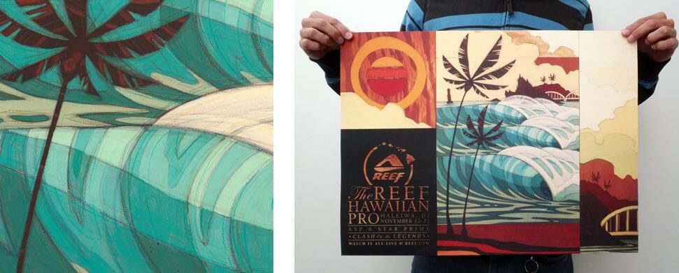
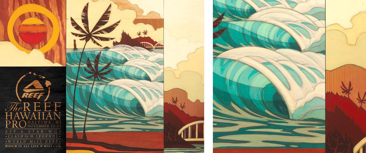
After returning to the states, I started working with Reef’s graphics team to put together different concepts and narrow it down to these comps. There were a few elements that needed to be included such as the bridge over the Anahulu River and the red buoy. The viewpoint also needed to show stacked-up rights with Pua’ena Point in the background.
I don’t know how surfing magazine editors get anything done. What started out as a quick search for Haleiwa line-up shots for reference, turned into several hours of nostalgic-glaze-eyed-I-wish-I-was-surfing-tropical-tubes-right-now, kind of internet time warp. The day wrecker kind. Luckily I was able to snap out of it before dark and go for a surf!
Cody, Greg, and the team offered some great art direction with this project. We went back and forth for a few rounds to lock in color scheme and overall composition with the extra side and top panels.

The final composition and artwork ended up like this:
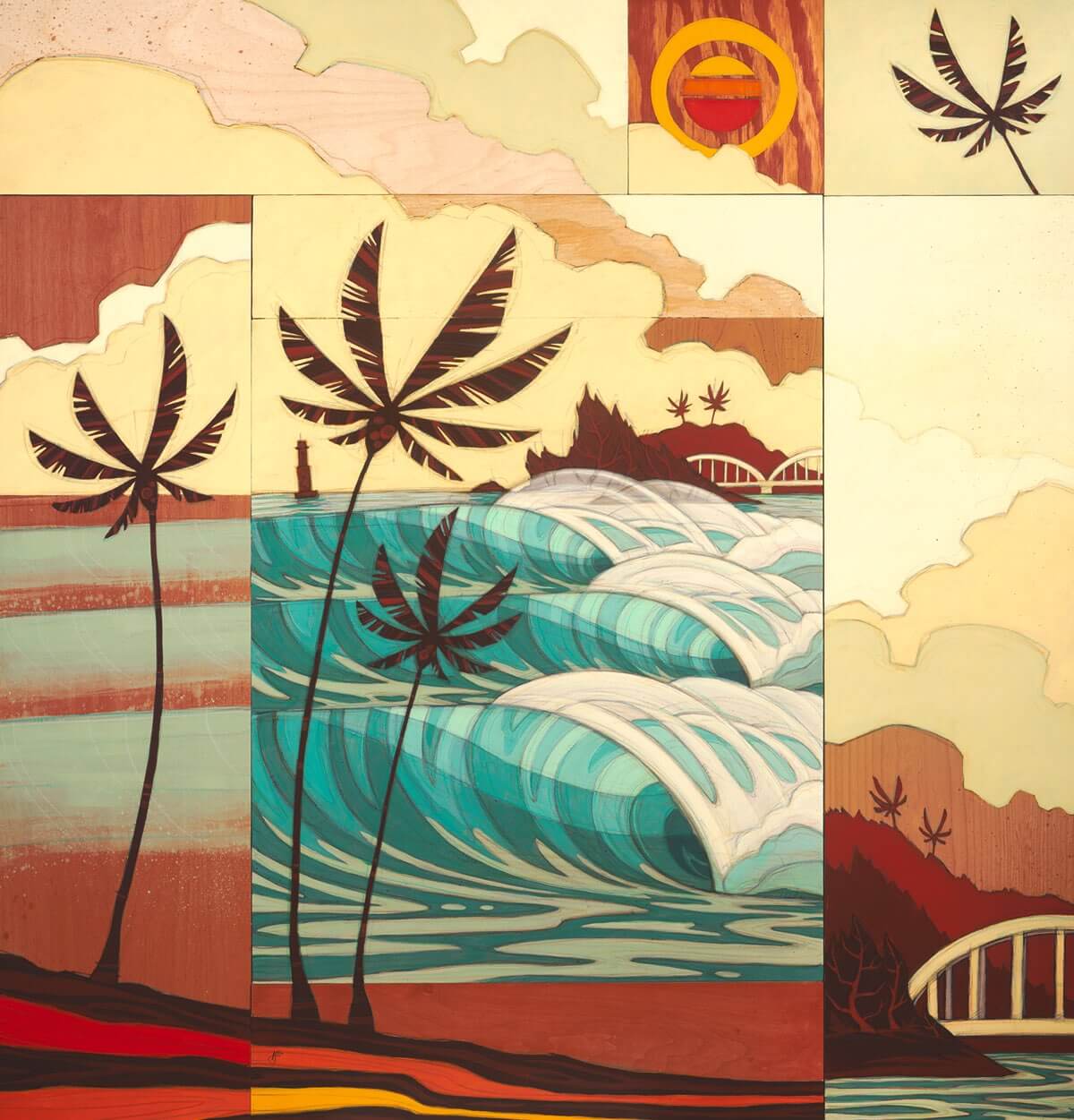
I think this design is somewhat unique for event artwork because of the several different sections or pieces that make up the design. It offers a ton of options for the design team to mix it up for different formats in advertisements, apparel, and the event space. As you can see in a few of the surf magazine ads:

So when I got the green light on the last color comp, it was time to start digging around for the right wood to build the panels. The structure was made entirely from found wood and there’s quite a contraption of metal braces, screws, and washers holding it all together on the back. It’s almost comical.
Building the structure to paint on is one of my favorites parts of making art. Even if it’s just cutting a few simple pieces of wood and sanding the edges. It’s like the beginning of a ritual, it grounds me and lets me think through the process. There’s a sort of satisfaction with constructing a piece from start to finish rather than just buying a ready-to-paint canvas at the art store.
The Reef Hawaiian Pro artwork was the piece that popped my new studio’s cherry. As you can see from some of the pics below, it’s pretty tidy and sparse in there. Can’t think of a better way to kick off the new space!

To start off the process, all the panels get laid out and trimmed to fit together snuggly. I rough out a pencil sketch and figure out which areas I want to prime with white so the colors stay nice and bright when I start with the paint. Many of the bare wood areas get sealed with a layer of clear acrylic medium to keep the paint and markers from bleeding or soaking into the wood too much as well as keep the natural pigment in the wood from bleeding into the paint.
After the composition gets laid out, it turns into a flurry of Prismacolor markers, colored pencils, and layers of acrylic paint. Paint goes over marker, marker goes over paint. I try to keep it loose and fun and keep that sketchbook energy flowing. I think it’s nice to see the old lines that were made, even if they were the wrong ones. It gives the painting a sort of energetic history.

The structure was taken apart and each wood section was painted individually so I could get messy with markers and splatters without having to worry about it getting on the other panels. It also let me treat each piece as it’s own painting by itself, which I think adds to the overall effect when it all gets put back together.
That’s about it. I always apply a layer of clear acrylic medium as well as a final gloss or semi-gloss Polycrylic protective coating to give the colors a rich pop.
When completed, I delivered the piece to Reef to make the hand-off and let the talent of the Reef design team take over with the Reef Hawaiian Pro logo and branding. And I think they did a hell of a job!
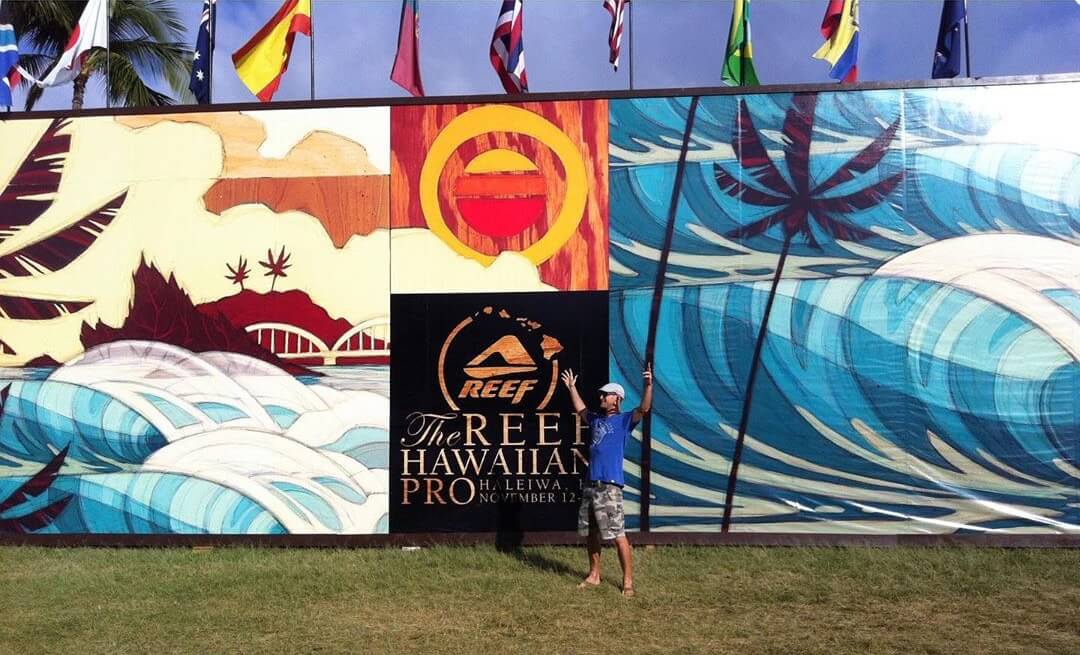
I’ll be heading out to Hawaii for the event in November. It’ll be insane to see the artwork blown up massive on the Judging tower and all over the event. Definitely the coolest part of this project for me. It’ll also be insane to sneak into a few warm North Shore tubes! Yeeeoww!
I hope you enjoyed some insight into the creation of the 2011 Reef Hawaiian Pro artwork.
Curated by Erik Abel on Nov 20, 2011